Build your first scheduled report
In this tutorial you will write a query in ScoutQL — Scout’s report query
language — preview it against your server’s real match history, turn it into a
chart, and schedule it to post itself to a channel every week. You will meet
SELECT, FROM, WHERE, GROUP BY, ORDER BY, and RENDER.
You need at least one tracked player who has played recently. The queries below look at the last 30 days. When you add an account, Scout quietly imports up to its 20 most recent games, so a new server usually has useful rows within a few minutes. An account with no recent games still returns empty rows.
What you will end up with
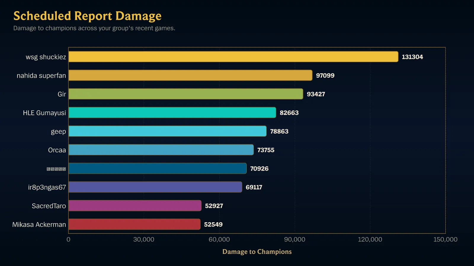
Section titled “What you will end up with”A chart that posts itself on a schedule:
1. Open the report editor
Section titled “1. Open the report editor”Go to Manage Scout, choose your server, open Reports tab, and choose New report.
2. Start from a preset
Section titled “2. Start from a preset”Choose Use a preset. Under Leaderboards, choose Most games played. It loads this query into the editor:
SELECT COUNT(*) AS games, AVG(win::INT) AS win_rateFROM match_participantsWHERE game_creation_at >= CURRENT_TIMESTAMP - INTERVAL 30 DAYGROUP BY playerORDER BY games DESCLIMIT 10RENDER leaderboardRead it once before changing anything:
SELECT COUNT(*) AS games, AVG(win::INT) AS win_rate— the two numbers you want per row, each named.COUNT(*)counts matches;AVG(win::INT)averages a win/loss flag, which is a win rate.FROM match_participants— one row per tracked player per match.WHERE game_creation_at >= CURRENT_TIMESTAMP - INTERVAL 30 DAY— the last 30 days. This is an ordinary condition, not a special clause.GROUP BY player— collapse those rows to one per player.ORDER BY games DESC— most active first.LIMIT 10— at most ten rows.RENDER leaderboard— display it as a ranked list.
The ::INT in AVG(win::INT) is not decoration. win is true or false, and
an average of a true/false value is undefined until it is a number — so the
cast is what turns “did they win?” into “how often do they win?”.
3. Watch the preview
Section titled “3. Watch the preview”You do not have to run anything. Live preview re-runs the query against your server’s match history as you edit and shows the rows it would post, along with how many were returned and how many were scanned.
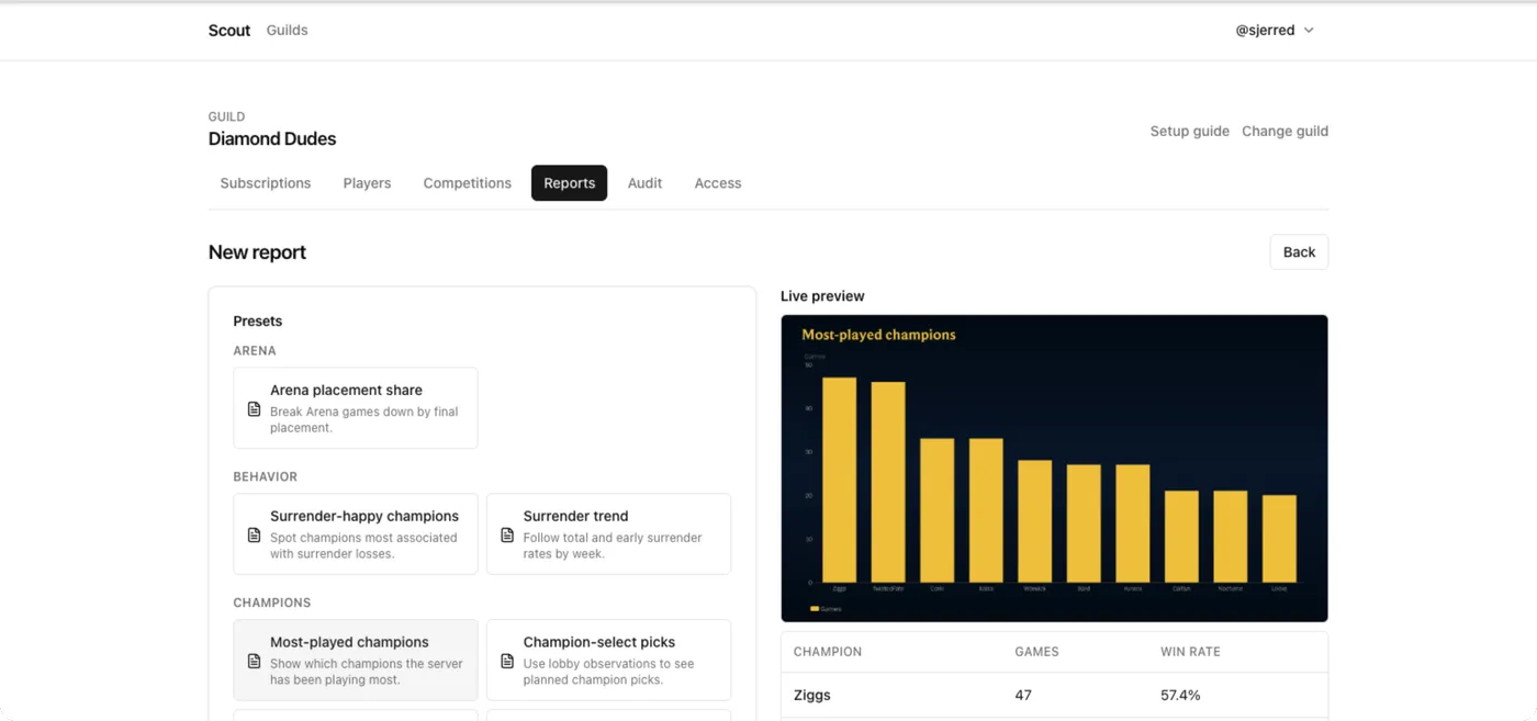
This is real data, not a sample — if a player is missing, they have not played in the window.
The preview shows the evidence basis for each result. Rates say Based on N games. A rate supported by fewer than 10 games is marked Fewer than 10 games — treat this rate as indicative only. All results describe matches Scout recorded, not League-wide truth.
4. Change what it measures
Section titled “4. Change what it measures”Replace the two outputs with total damage dealt to champions:
SELECT SUM(total_damage_dealt_to_champions) AS damageFROM match_participantsWHERE game_creation_at >= CURRENT_TIMESTAMP - INTERVAL 30 DAYGROUP BY playerORDER BY damage DESCLIMIT 10RENDER leaderboardThe preview re-ranks by total damage within a second or so.
Note that the aggregate is written out. There is no shorthand where a bare
column silently becomes a sum — SUM, AVG, COUNT, MEDIAN and the rest
are always explicit, so a report never quietly measures something other than
what it says. Every column you can name is in the source and column
reference, and everything you can compute
from one is in the function reference.
5. Turn it into a chart
Section titled “5. Turn it into a chart”Change the last line to render a bar chart, and tell it which output to plot:
SELECT SUM(total_damage_dealt_to_champions) AS damageFROM match_participantsWHERE game_creation_at >= CURRENT_TIMESTAMP - INTERVAL 30 DAYGROUP BY playerORDER BY damage DESCLIMIT 10RENDER bar_chart WITH (y = damage, orientation = horizontal)The preview now renders the actual chart image Scout will post, with the data
table underneath it. RENDER picks the display kind; WITH (...) configures
it. y = damage works because damage is the name you gave the output — a
name the SELECT does not produce is rejected rather than plotted as nothing.
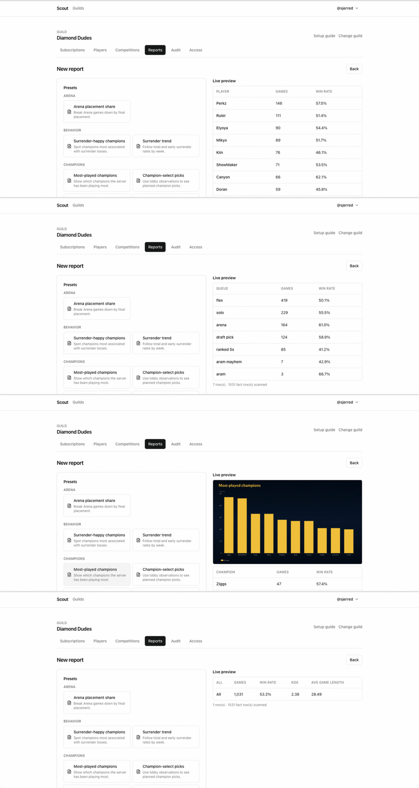
Switching presets is the fastest way to see what the other kinds look like — the preview re-renders each one against your own data:
6. Give it a title and a destination
Section titled “6. Give it a title and a destination”In the report form, fill in:
- Title —
Weekly damage leaders. - Channel — the channel the report should post to.
7. Schedule it
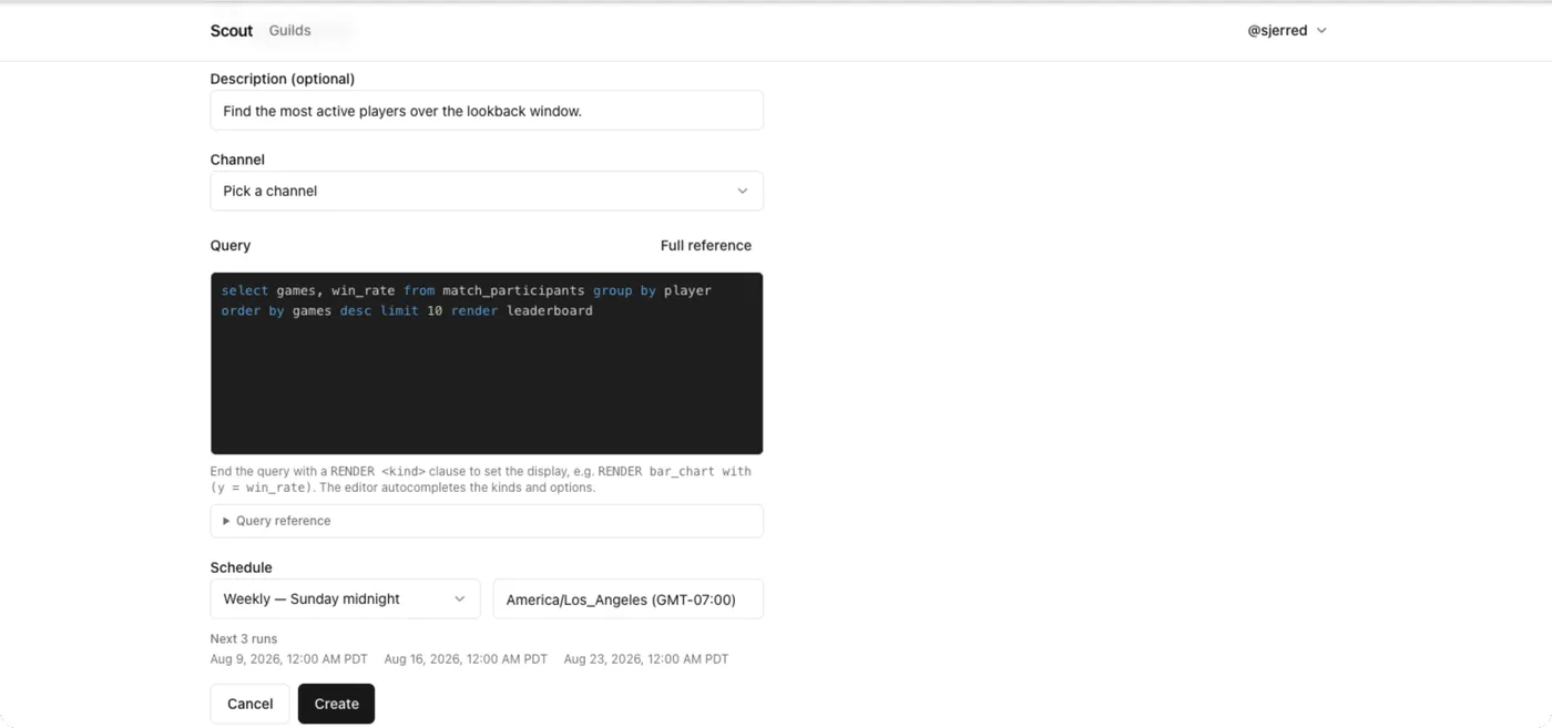
Section titled “7. Schedule it”Under Schedule, choose the preset Weekly — Monday midnight, and check that the timezone next to it is the one you want. It defaults to your browser’s timezone, and Next 3 runs underneath shows exactly when the report will fire.
8. Save it
Section titled “8. Save it”Choose Create. The report appears in the list with its schedule and next run time.
9. Run it once without waiting
Section titled “9. Run it once without waiting”Open the report and choose Run now.
Scout executes the query and posts the chart to the channel you picked, exactly as the schedule will. The run is recorded in the report’s history with its status, duration, and row count — and a manual run does not disturb the schedule.
What you did
Section titled “What you did”You wrote a ScoutQL query, previewed it against real match data, changed what it measured, rendered it as a chart, and put it on a weekly schedule.
From here:
- Learn the whole language in the ScoutQL reference.
- Work from the recipe list — win rates, percentiles, trends, histograms.
- See every display kind in Render kinds and options.
- Chart two dimensions at once with Turn a report into a chart.