Turn a report into a chart
Any report can render as a chart by ending its query with RENDER <kind> and
configuring it with WITH (...). A query with no RENDER clause renders as a
table.
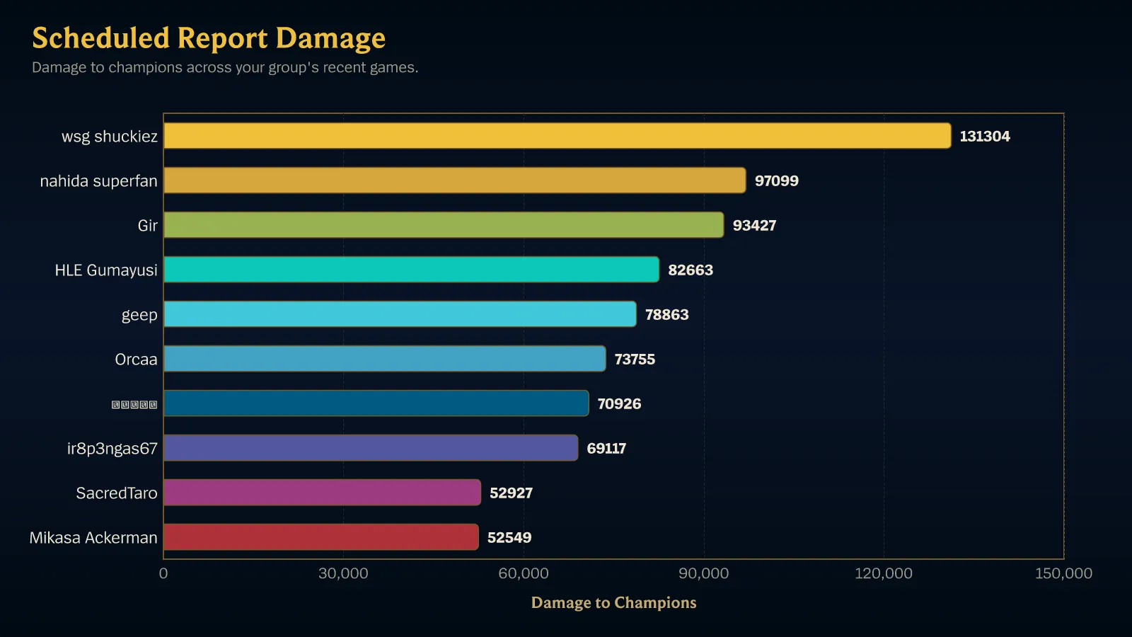
Pick a kind that suits the shape of your data
Section titled “Pick a kind that suits the shape of your data”- Ranking a handful of things →
bar_chart, orleaderboardfor text with mentions. - Change over time →
line_chartorarea_chart, grouped byDATE_TRUNC('day' | 'week' | 'month', …). - Parts of a whole →
donut_chart, and only when rows are few and actually sum to something meaningful. - Two dimensions at once →
heatmap, grouped by two dimensions. - Comparing two numbers per row →
scatter_chart. - One headline number →
kpi_card, with noGROUP BYat all. - Comparing several normalized outputs →
radar_chart, three to eight of them. - The shape of a distribution →
histogramfor counts per bucket,box_plotfor a five-number summary per group.
Every kind and what it requires is in Render kinds and options.
Map outputs to the chart
Section titled “Map outputs to the chart”WITH (...) binds your query’s outputs to chart channels:
SELECT COUNT(*) AS games, AVG(win::INT) AS win_rateFROM match_participantsWHERE game_creation_at >= CURRENT_TIMESTAMP - INTERVAL 30 DAYGROUP BY championORDER BY games DESCLIMIT 10RENDER bar_chart WITH (y = games, orientation = horizontal)yis the numeric series — up to eight of them, asy = (a, b).xis the horizontal channel; it defaults to the grouping.valueis the cell value for a heatmap.sizesizes scatter points.
A name inside WITH (...) must be one the SELECT produced. That is checked
when the query compiles, so a chart no longer renders empty because y pointed
at nothing — it refuses to save instead.
Read the evidence
Section titled “Read the evidence”Scout reports describe matches Scout has ingested for tracked players. They do not describe every League match or the whole ranked ladder. Rates and derived values show their game basis as Based on N games. When fewer than 10 games support a rate, Scout adds: Fewer than 10 games — treat this rate as indicative only.
Chart a trend
Section titled “Chart a trend”Group by a truncated timestamp rather than a player or champion, and echo the
same expression in the SELECT so the bucket has a name to plot and sort by:
SELECT DATE_TRUNC('week', game_creation_at) AS week, COUNT(*) AS games, AVG(win::INT) AS win_rateFROM match_participantsWHERE queue IN ('solo', 'flex') AND game_creation_at >= CURRENT_TIMESTAMP - INTERVAL 90 DAYGROUP BY DATE_TRUNC('week', game_creation_at)ORDER BY week ASCRENDER line_chart WITH (y = win_rate, x_axis = 'Week', smooth = true)Note ORDER BY week ASC — a time chart sorted by value reads as noise.
Compare against the previous period
Section titled “Compare against the previous period”Add compare = previous_period to overlay the equally long span immediately
before the window. It needs the stated window and the time bucket to line the
two runs up:
SELECT DATE_TRUNC('week', game_creation_at) AS week, COUNT(*) AS gamesFROM match_participantsWHERE game_creation_at >= CURRENT_TIMESTAMP - INTERVAL 28 DAYGROUP BY DATE_TRUNC('week', game_creation_at)ORDER BY week ASCRENDER line_chart WITH (y = games, compare = previous_period)Chart two dimensions
Section titled “Chart two dimensions”A heatmap needs exactly two groupings and a value:
SELECT COUNT(*) AS gamesFROM match_participantsWHERE game_creation_at >= CURRENT_TIMESTAMP - INTERVAL 30 DAYGROUP BY champion, team_positionORDER BY games DESCRENDER heatmap WITH (value = games, series = team_position)Show one number
Section titled “Show one number”SELECT COUNT(*) AS games, AVG(win::INT) AS win_rate, kda() AS kdaFROM match_participantsWHERE queue = 'solo' AND game_creation_at >= CURRENT_TIMESTAMP - INTERVAL 30 DAYRENDER kpi_card WITH (y = (games, win_rate, kda))No GROUP BY means one grand-total row, which is what a KPI card displays.
Chart a distribution
Section titled “Chart a distribution”A histogram buckets a numeric column and counts rows per bucket. Divide to assign the bucket, multiply to restore its real starting value:
SELECT FLOOR(game_duration_seconds / 300) * 300 AS bucket, COUNT(*) AS gamesFROM match_participantsWHERE game_creation_at >= CURRENT_TIMESTAMP - INTERVAL 30 DAYGROUP BY FLOOR(game_duration_seconds / 300) * 300ORDER BY bucket ASCRENDER histogram WITH (x = bucket, y = games)Style it
Section titled “Style it”SELECT AVG(win::INT) AS win_rateFROM match_participantsWHERE queue = 'solo' AND game_creation_at >= CURRENT_TIMESTAMP - INTERVAL 30 DAYGROUP BY championORDER BY win_rate DESCLIMIT 10RENDER bar_chart WITH ( y = win_rate, title = 'Ranked win rate', subtitle = 'Last 30 days', y_axis = 'Win rate', theme = lol_dark, palette = colorblind, labels = percent, legend = none)theme—lol_dark,lol_light,minimal_dark,minimal_light.palette—ranked,categorical,team,gold,colorblind. Usecolorblindfor anything the whole server reads.colors = (#rrggbb, …)— up to eight custom colors, contrast-corrected for the theme.labels—auto,show,hide,value,percent.sort— reorders the chart visually without changing the query’s rows.
Strings inside WITH (...) are single-quoted, like everywhere else in the
language.
Keep charts readable
Section titled “Keep charts readable”Reports return at most 25 rows, and far fewer is usually better: a bar chart
with 25 categories is unreadable in a Discord message. Set an explicit LIMIT
of about 10 and let ORDER BY decide what matters.